Divi Global Modules, Rows & Sections
Create a library item that syncs between all of the pages you use it on.
What Is A Global Library Item?
A Global library item is a module, row or section that appears exactly the same on whatever pages it is added to. You can add a single global module to multiple pages. If you change the global module on one page, it gets updated instantly on all of the other pages it has been added to as well. A simple use-case for this would be a Call To Action Module that appears at the bottom of many or all of the pages on your website. If a single module is repeated on multiple pages, it’s very useful to make this module Global. This way, you don’t have to edit every single page when you want to make a change to it.Global elements open up so many possibilities, especially when you consider that you can selectively sync individual settings for each module. For example, you could create a global Header Module that appears at the top of all of your pages, and choose to only sync certain options in the Design and Advanced Tabs. This will allow you to apply custom styling to the entire series of pages using this global header module, but still allow you to add unique title text content to each module within the modules “Content” tab (which has not been synced). If you ever want to adjust the look and feel of these global header modules, you only have to edit the options you chose to be synced once. Entire sections can also be made into global sections. This is a perfect way to create a custom footer for your entire site, and have that footer section mirrored across all of your pages. If you ever want to change your global footer section, you only have to edit it once and the changes get applied everywhere the section has been used.
Creating A New Global Library Item
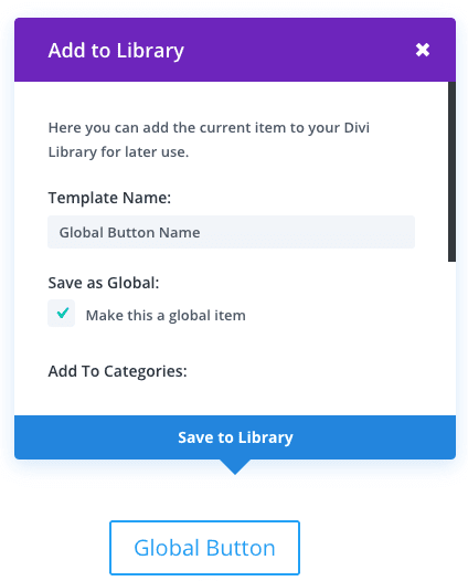
Making a library item global is simple. When saving your library item, check the “Save As Global” option. Any item that is saved with this option selected becomes a global item.
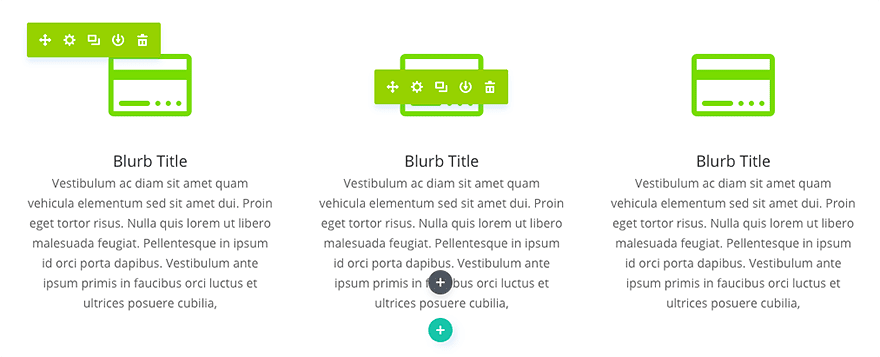
Global items within the page builder are easily identified by their green color. If you are editing a module, row or section that is green, or if the current modal settings window that you have open is green, then you know that you are currently editing a global item. It’s important to know when a global item is being edited, because any change you make will be mirrored across every page that item has been placed on.
Global Modules & Selective Sync
As mentioned previously, you can selective sync any of the module settings options when saving a global library item. For example, if you create a new global module and choose to only sync the “Background Color” option, then only the “Background Color” for that module will be mirrored. What does this mean exactly and why is it useful?
Let’s say you have a Fullwidth Header module at the top of all of your pages. This is quite common. Each header module has a different title in the “Content” tab to represent the current page. You have also edited the options in the “Design” tab to give your header a unique look by adjusting the title font color to blue, title font style to Bold & All Caps, and title font size to 40px. You want all of you header modules on each page to use this unique style, but you need each page to have unique titles. In this case, you can create a Global Fullwidth Header module and choose to selectively sync only those options (font color, font style, and font size).
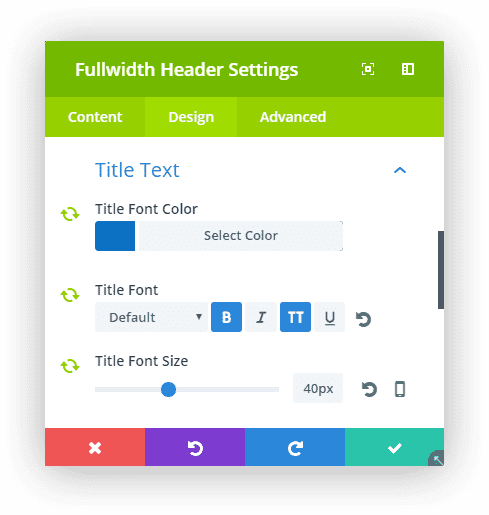
Now whenever you add this global module to a new page, these options will be synced, but all of your other options will remain unique for the current module.
If you ever want to change the style of the headers on all your pages, you can modify the synced options for the header text style shared by these global modules and the changes will be reflected on every single page that global header has been used! Wow, that saves you an incredible amount of time.
This same theory could be applied to the options in the “Advanced” tab as well. Let’s say that you have created a Slider Module and applied a unique animation to the slider’s button. You want to use this new unique animation on all of the Slider Modules on your website. In this case, you can create a new Global Slider Module and selectively sync the Custom CSS for the Slide Button (which includes your custom CSS animation).
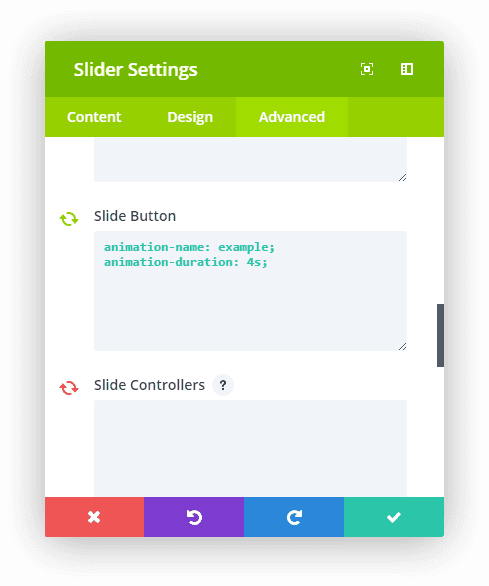
Add this slider to your page and you can adjust all of the other options freely, while keeping your unique Custom CSS option synced across the entire series of modules. If you ever want to adjust the Custom CSS option for this series of global modules, you only have to do it once. Editing the Custom CSS option in one module updates for all implementations of this Global Slider Module.
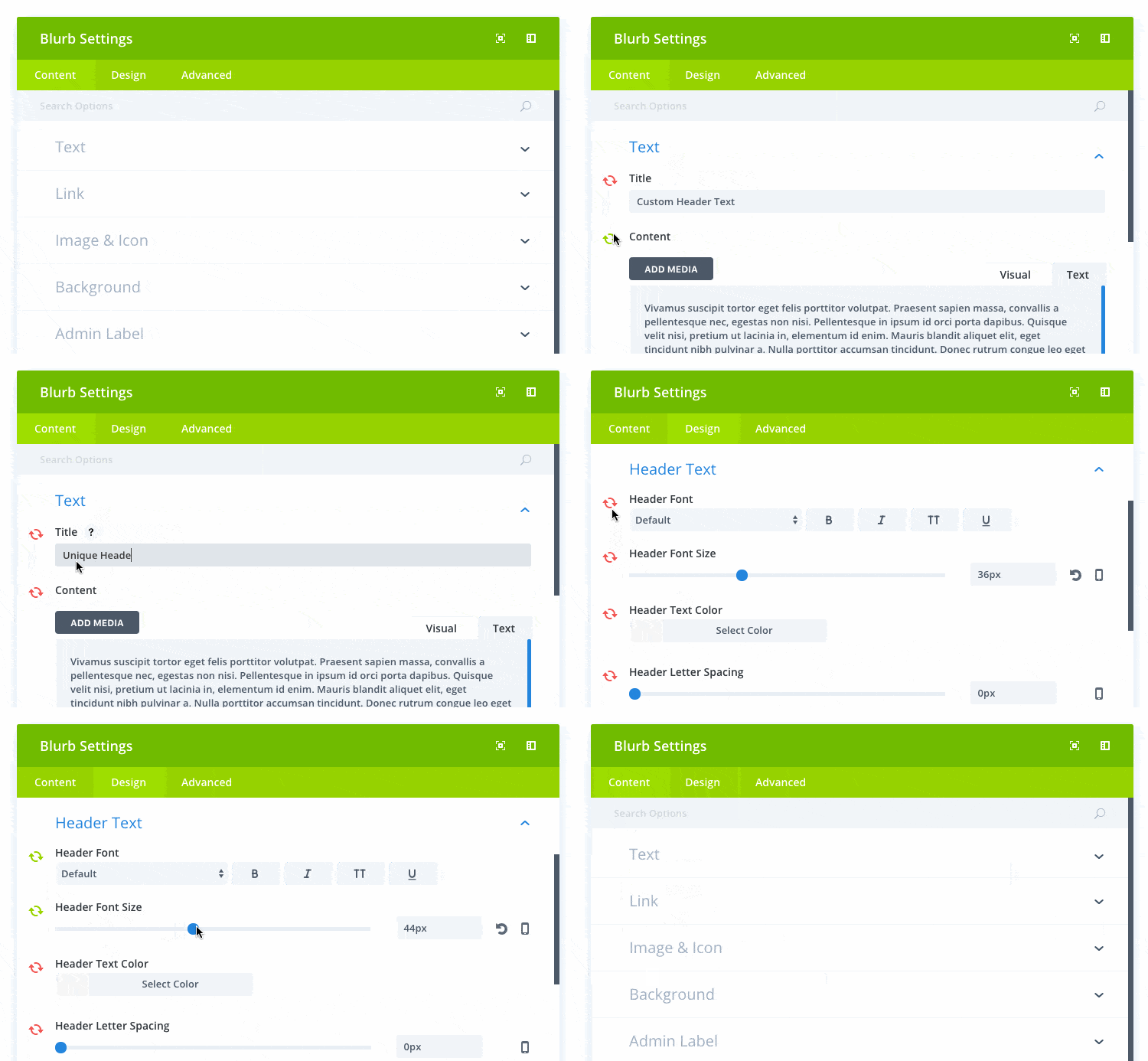
Whenever you edit a global module, you can easily identify which options are currently being synced by the green sync icon located on the left of each option. Options that have the green sync icon are options that are currently being synced within the global module. Options edited with green sync icons are shared by all instances of the global item. To un-sync an option, simply click the green sync icon and you will see the icon turn red. Options that have the red sync icon are NOT currently being synced within the global module.

