Divi WooCommerce Modules Pg 2
Creating a Product
To create a new product, go to the WordPress dashboard and navigate to Products > Add New.
Then enter the product information you want displayed on the product page.
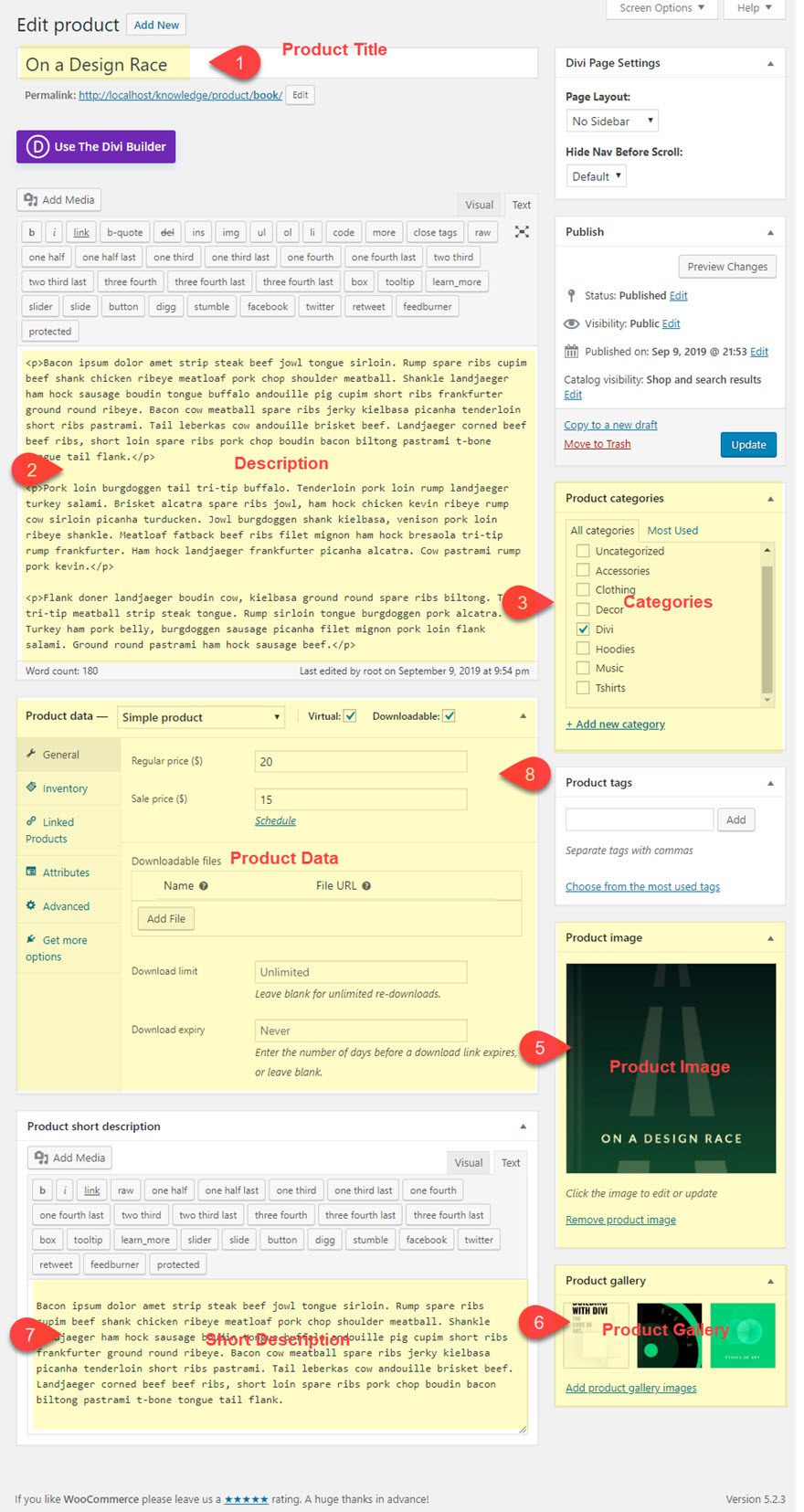
For the Product Data, Select a Simple Product from the dropdown.
Then add the following info:
General
- Regular Price: 20
- Sale Price: 15
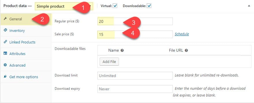
This info will be displayed by the Woo Price Module.
Inventory
- SKU: sku-123-1
- Select Enable stock management at product level
- Stock Quantity: 10
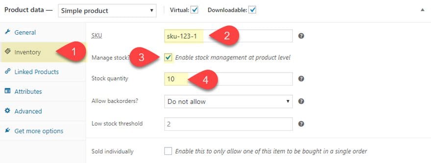
This info will be displayed by the Woo Meta Module along with the Product Categories and Tags.
Linked Products
- Upsells: [add three products to serve as mock upsell products]
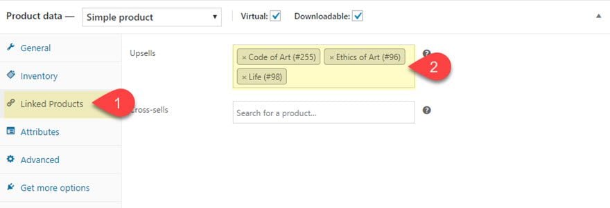
This info will be displayed by the Woo Upsell Module.
Attributes
Add a custom attribute named “size” with the following values:
- Large
- Medium
- Small
Then make sure to click the checkbox to make the attribute visible on the product page.
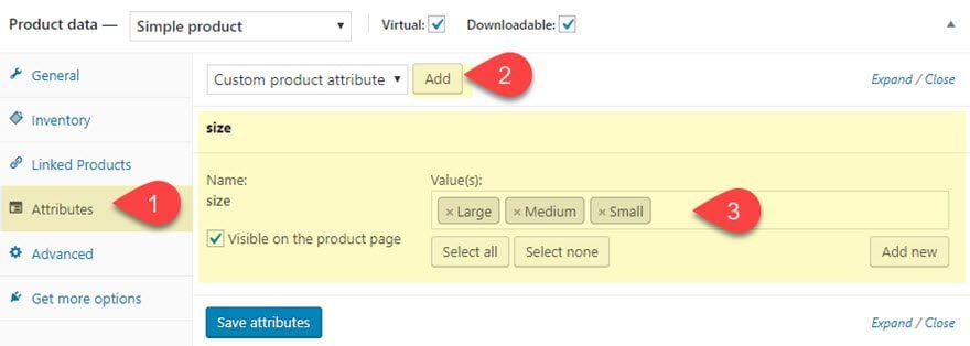
This info will be displayed by the Woo Additional Information Module and also included in the Woo Tabs module if Additional Information is selected to be displayed.
Activating the Divi Builder on the Product Page
After the Product Information has been entered, click to use the Divi Builder.
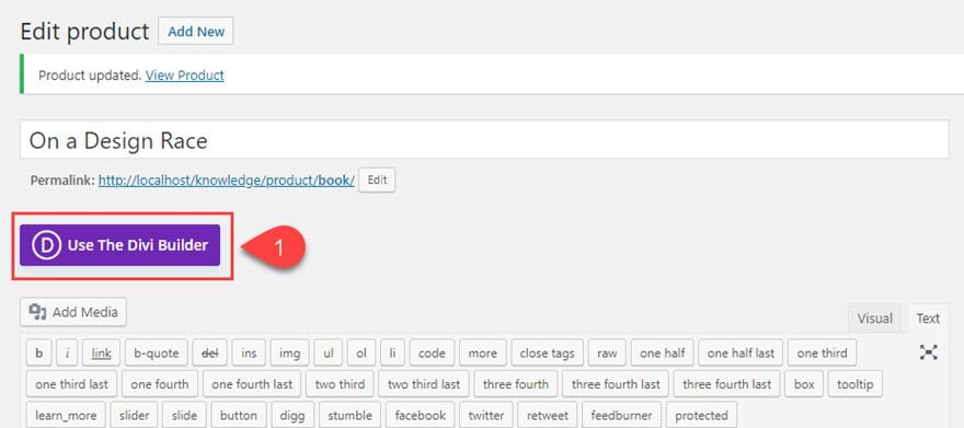
This will automatically convert the product page layout into a separate Divi Elements, with each WooCommerce Element converted to a customizable Woo Module. The Divi Builder will populate the area where the long description content used to be. The new location of the long description content will be located at the bottom of the product page.
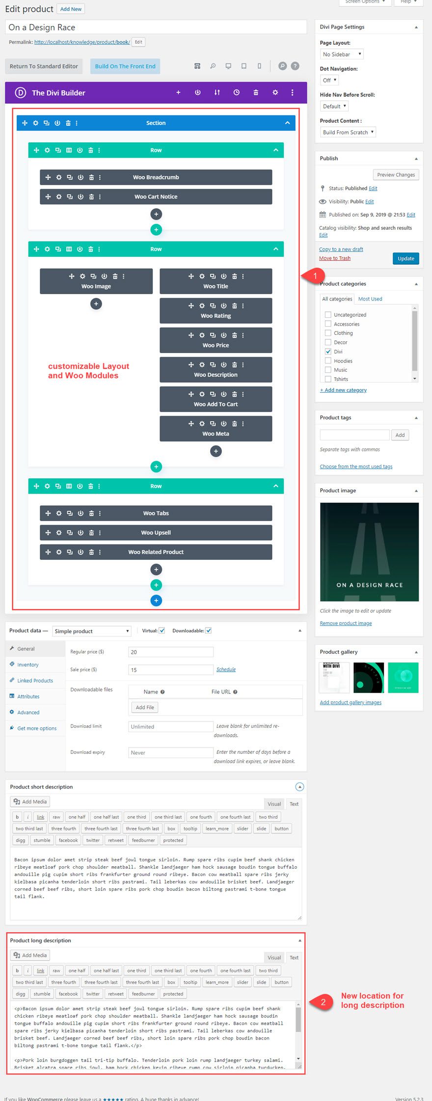
NOTE: You can always update the product information after deploying the Divi Builder. It will work the same way. In other words, you don’t have to update all of the product information before you deploy the Divi Builder if you don’t want to.
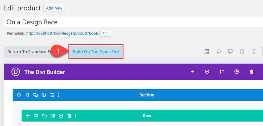
Next, click the button to build on the front end.
Designing the Woo Modules
Now we are ready to start design each of the Woo Modules to create a custom design of the product page.
Woo Breadcrumb Module Styling
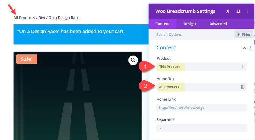
Let’s start at the top of the page with the Woo Breadcrumb module. Open the Woo Breadcrumb settings and update the following:
- Product: This Product
- Home Text: All Products (if your home link is to the shop or an all products page)
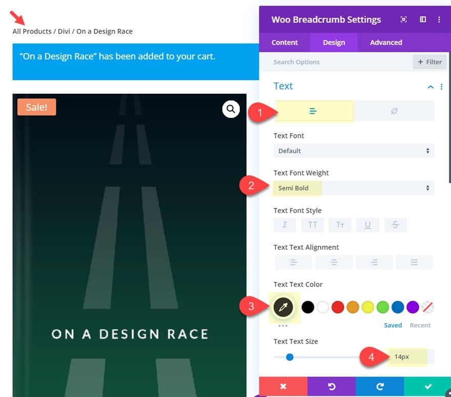
- Text Font Weight: Semi Bold
- Text Text Color: #333333
- Text Size: 14px
- Link Text Color: #d039a0
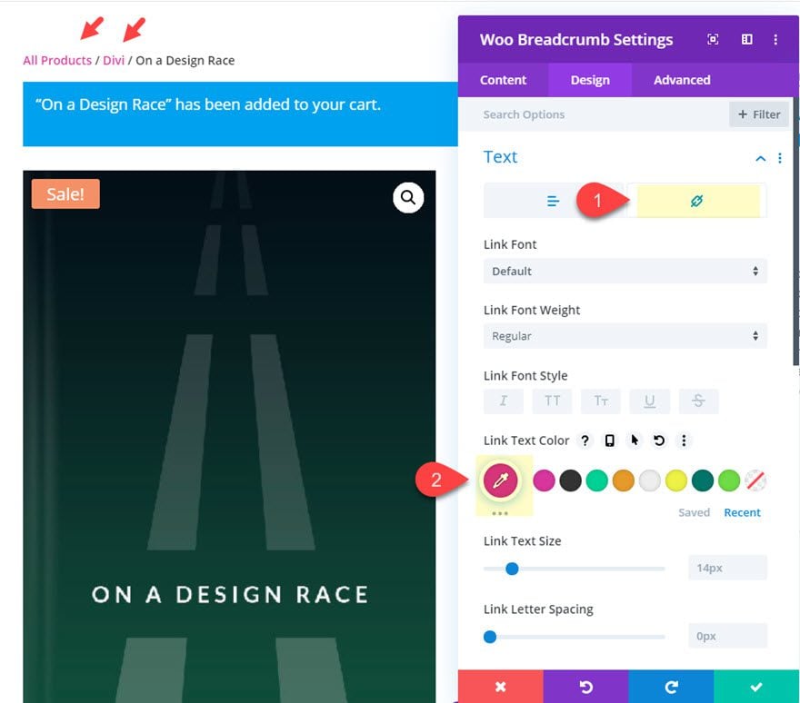
This will give the breadcrumbs some distinction between what is the current page and what are clickable links to parent pages.
Woo Notice Module Styling
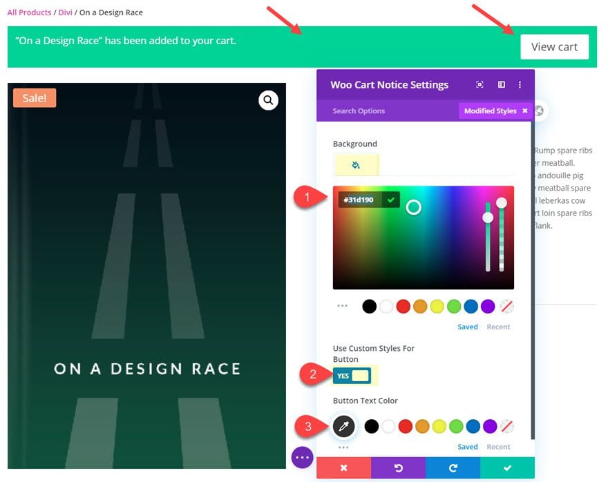
Next open the settings for the Woo Notice module and update the following:
- Background Color: #31d190
- Text Line Height: 2.8em
- Use Custom Styles for Button: YES
- Button Text Color: #333333
Woo Image Module Settings
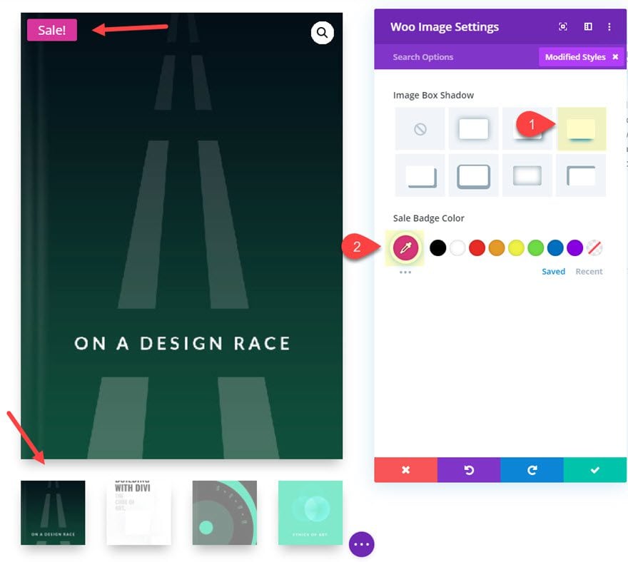
Next, open the Woo Image Module settings and update the following:
- Image Box Shadow: see screenshot
- Sale Badge Color: #d039a0
Woo Title Settings
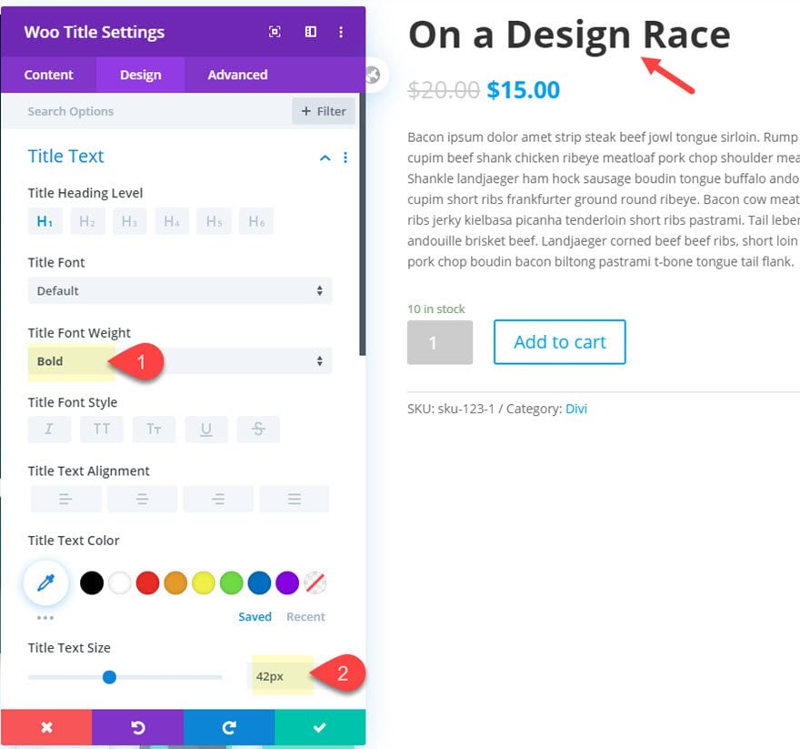
Next, update the Woo Title module settings as follows:
- Title Font Weight: Bold
- Title Text Size: 42px
Woo Reviews Module Settings
In order for Product Reviews to show on the front end, you must first make sure you have at least one review entered for the product. To enter a review, simply view the product on a live page, click the reviews tab, and enter a review with a star rating.
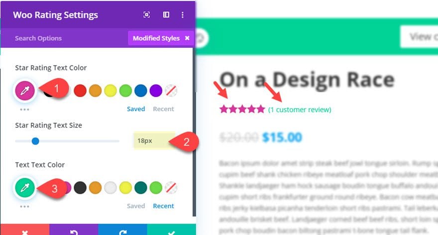
Now deploy the visual builder again. Open the Woo Review Module settings and update the following:
- Star Rating Text Color: #d039a0
- Star Rating Text Size: 18px
- Text Text Color: #31d190
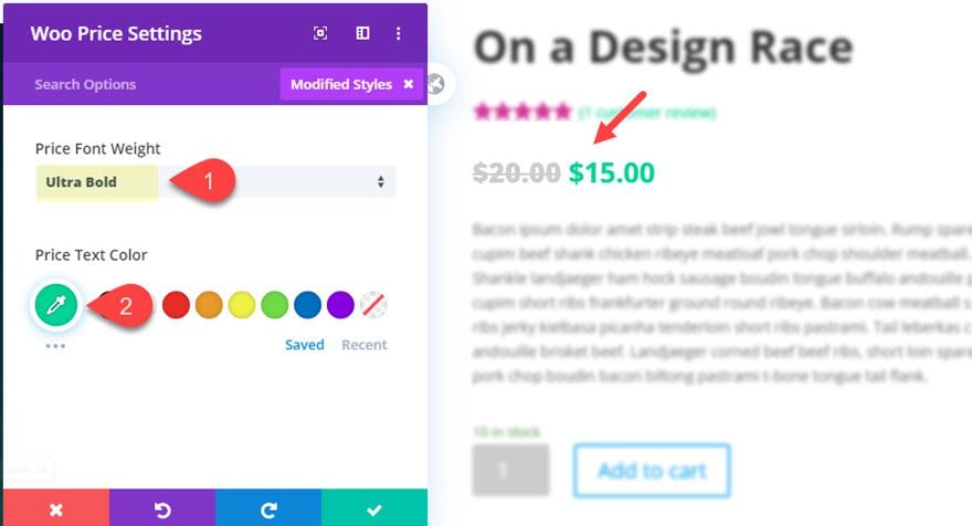
After the product rating is styled, open the Woo Price Module settings and update the following:
- Price Font Weight: Ultra Bold
- Price Text Color: #31d190
Woo Description Styling
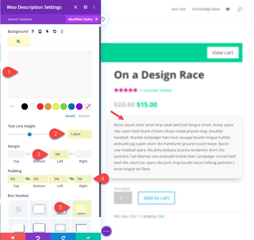
Next, update the Woo description module settings as follows:
- Background Color: #f8f8f8
- Text Line Height: 1.8em
- Margin: -5% Left
- Padding: 5% top, 5% bottom, 5% left, 5% right
- Box Shadow: See screenshot
Woo Add To Cart Styling
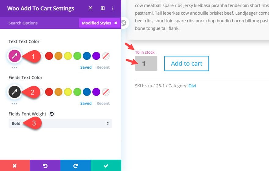
Open the Woo Add To Cart module settings and update the following:
- Text Text Color: #d039a0
- Fields Text Color: #333333
- Fields Font Weight: Bold
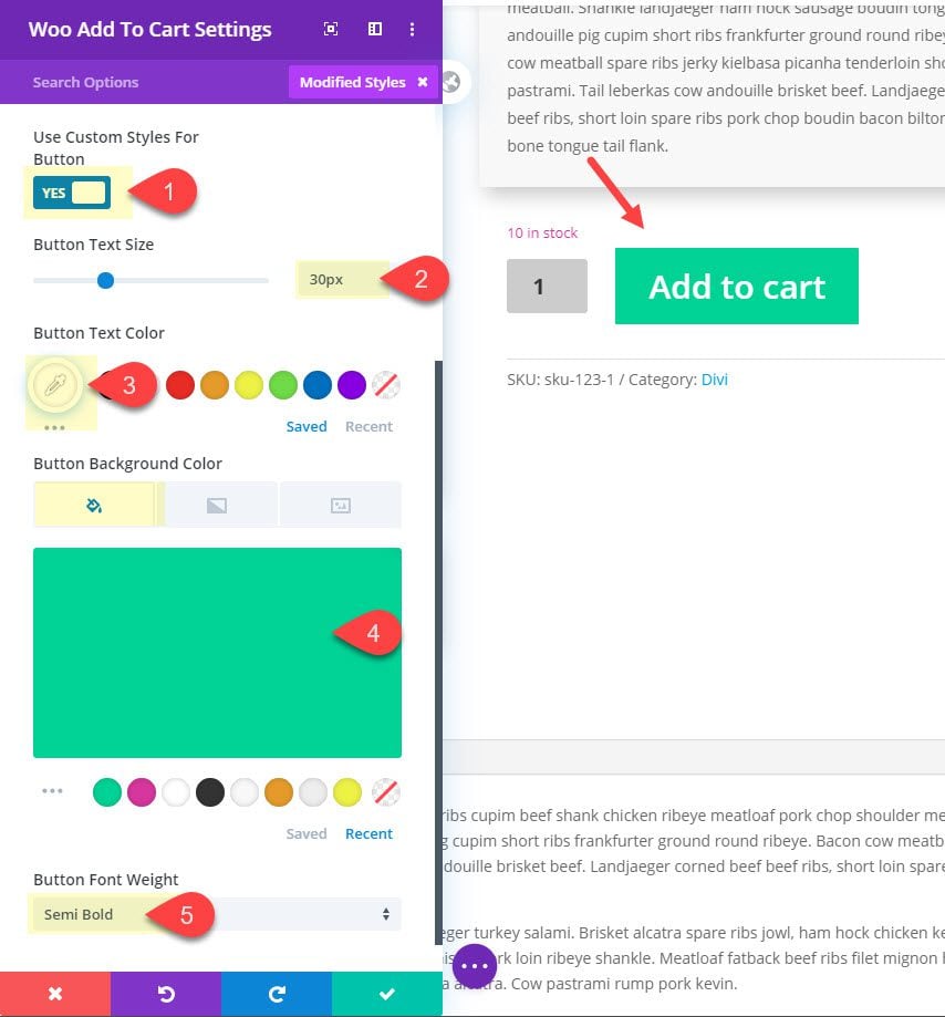
The update the button style as follows:
- Button Text Size: 30px
- Button Text Color: #ffffff
- Button Background Color: #31d190
- Button Font Weight: Semi Bold
Woo Meta Module Styling
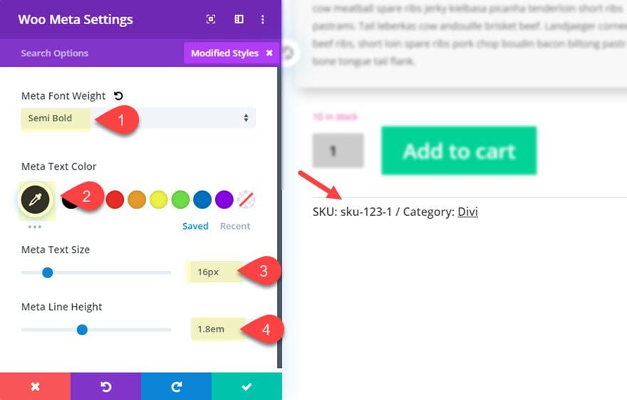
Next, open the Woo Meta Module settings and update the following:
- Meta Font Weight: Semi Bold
- Meta Text Color: #333333
- Meta Text Size: 16px
- Meta Line Height: 1.8em
- Link Font Style: Underline
Woo Tabs Module Settings
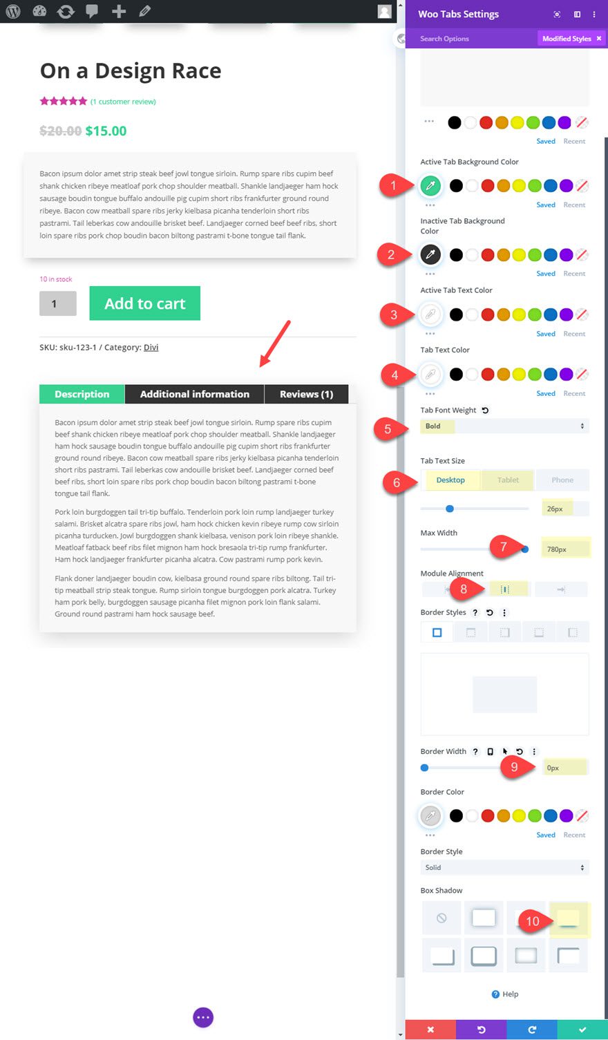
Open the Woo Tabs Module Settings and change the background color as follows:
- Background Color: #f8f8f8
Then update the rest of the design settings as follows:
- Active Tab Background Color:
- Inactive Tab Background Color: #333333
- Active Tab Text Color: #ffffff
- Tab Text Color: #ffffff
- Tab Font Weight: Bold
- Tab Text Size: 26px (desktop), 18.8px (tablet)
- Max Width: 780px
- Module Alignment: Center
- Border Width: 0px
- Box Shadow: see screenshot
Woo Upsell Module Settings
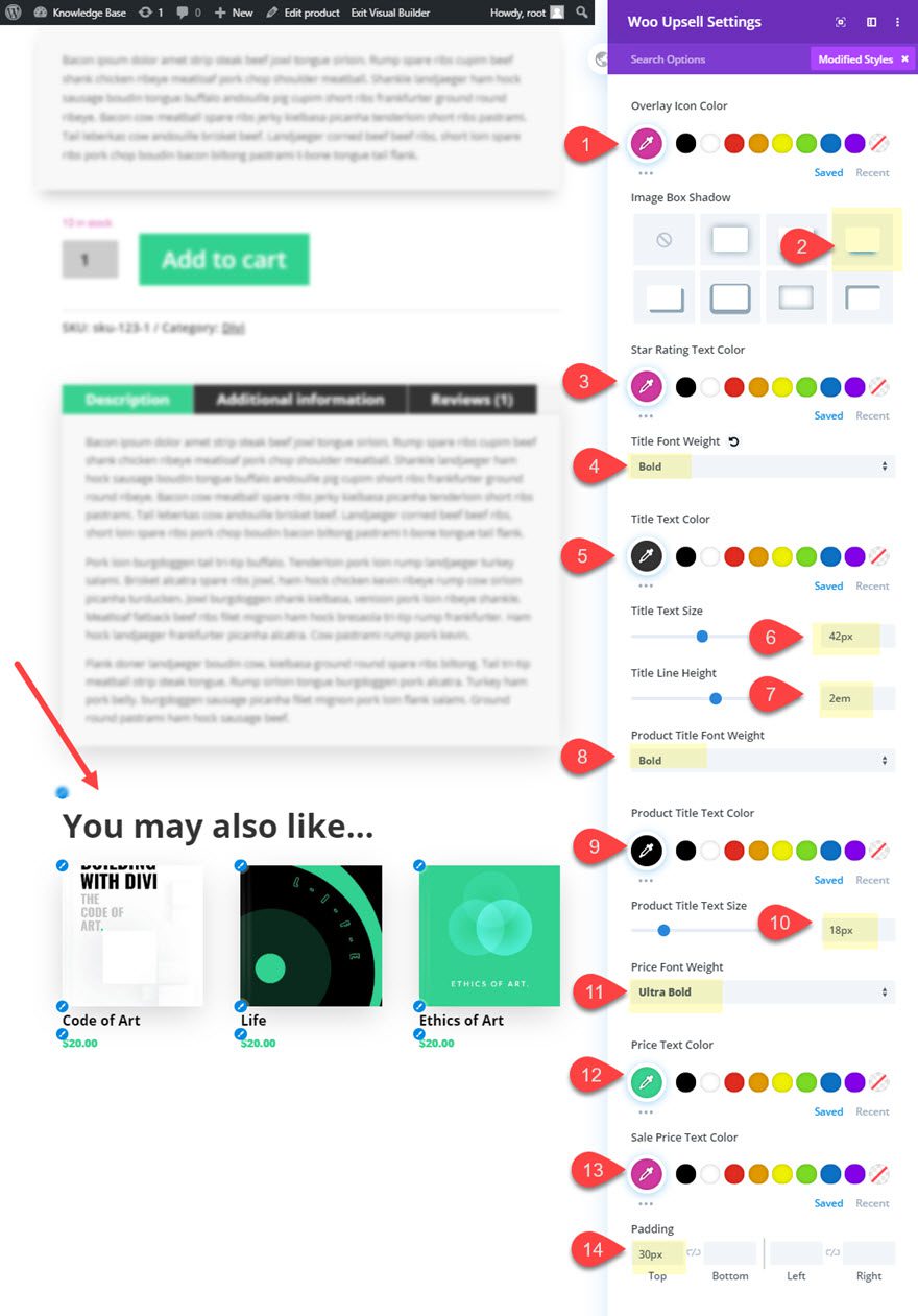
The Woo Upsell Module will display the products added to the Linked Product tab under Product Data when building the product. To update the style of upsells, open the Woo Upsell Module settings and update the following:
- Overlay Icon Color: #d039a0
- Image Box Shadow: see screenshot
- Star Rating: #d039a0
- Title Font Weight: Bold
- Title text Color: #333333
- Title Text Size: 42px
- Title Line Height: 2em
- Product Title Font Weight: Bold
- Product Title Text Color: #333333
- Product Title Text Size: 18px
- Price Font Weight: Ultra Bold
- Price Text Color: #39d190
- Sale Price Text Color: #d039a0
- Padding 30px top
Final Result
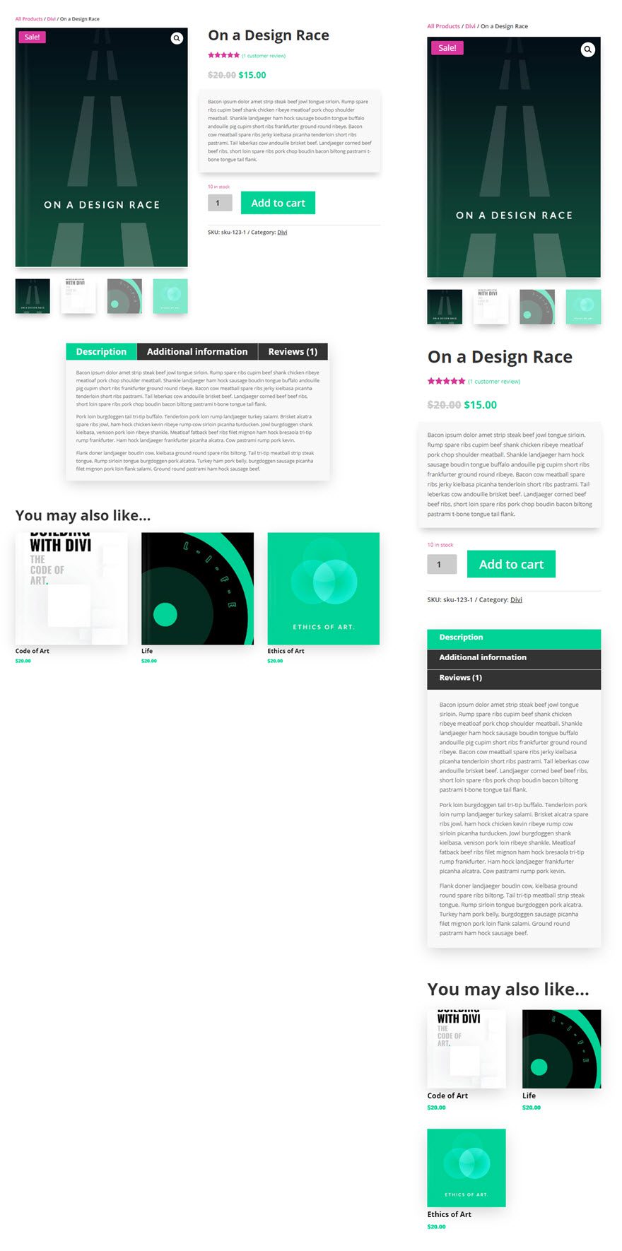
And here is the final result!
