The Divi Fullwidth Menu Module
How to add, configure and customize the Divi fullwidth menu module.
The Fullwidth Menu module lets you place a navigation menu anywhere on the page. This could be used to add a second menu down the page, or it could be used in conjunction with the Blank Page feature to move your main navigation down the page. For example, you could move your menu down below your first section to greet people with a large splash image. This essentially allow your header navigation to move around the page using the builder!
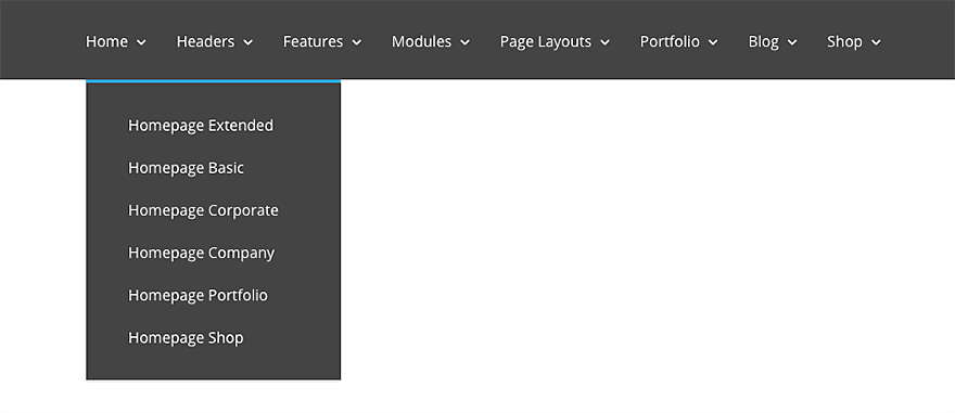
How To Add A Fullwidth Menu Module To Your Page
Before you can add a fullwidth menu module to your page, you will first need to jump into the Divi Builder. Once the Divi Theme has been installed on your website, you will notice a Use Divi Builder button above the post editor every time you are building a new page. Clicking this button will enable the Divi Builder, giving you access to all of the Divi Builder’s modules. Next, click the Use Visual Builder button to launch the builder in Visual Mode. You can also click the Enable Visual Builder button when browsing your website on the front end if you are logged in to your WordPress Dashboard.

Once you have entered the Visual Builder, you can click the gray plus button to add a new module to your page. New fullwidth modules can only be added inside of fullwidth sections. If you are starting a new page, don’t forget to add a fullwidth section to your page first. We have some great tutorials about how to use Divi’s section elements.
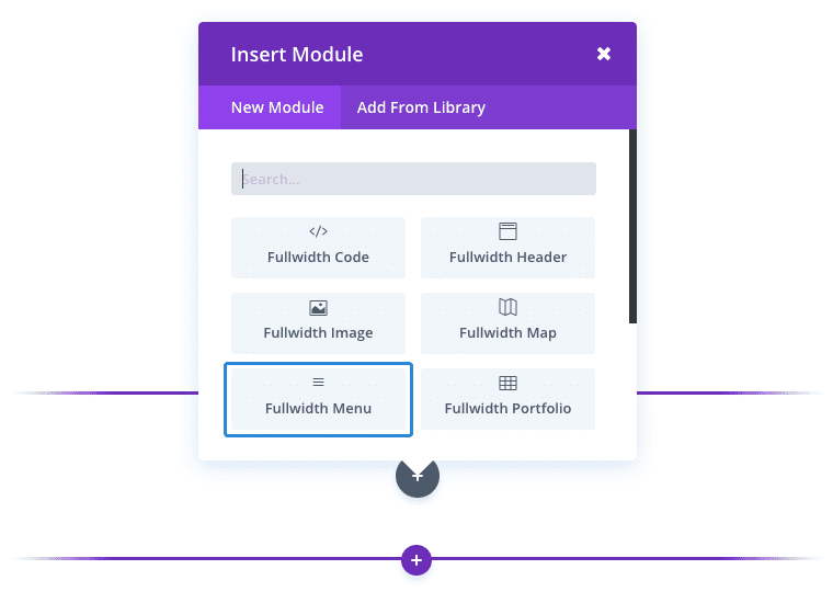
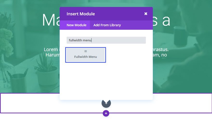
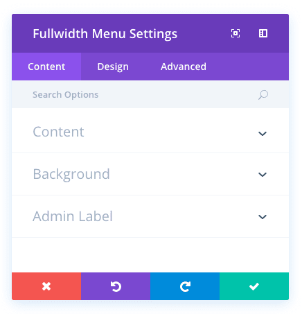
Locate the fullwidth menu module within the list of modules and click it to add it to your page. The module list is searchable, which means you can also type the word “fullwidth menu” and then click enter to automatically find and add the fullwidth menu module! Once the module has been added, you will be greeted with the module’s list of options. These options are separated into three main groups: Content, Design and Advanced.
Use Case Example: Adding a Fullwidth Menu Below the Page Header
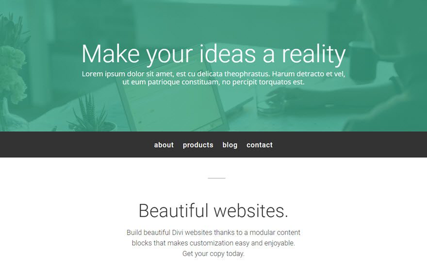
For this example, I’m going to show you how to add a fullwidth menu below the header section of a page.
Here is an example:
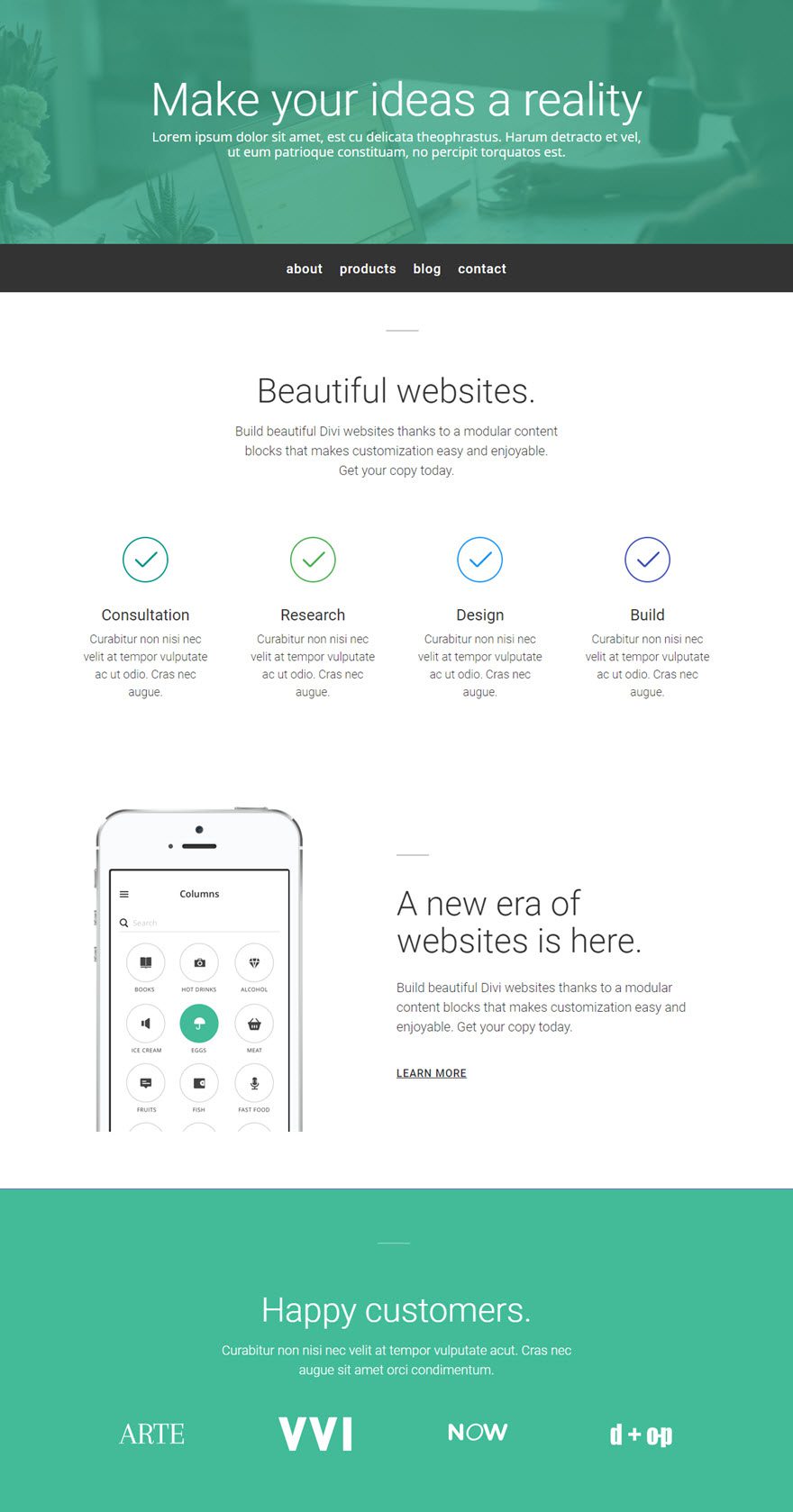
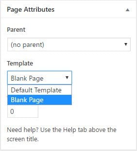
Since this new fullwidth menu will be replacing the default primary navigation menu, it is necessary to select the blank page template so that the default navigation menu doesn’t show at the top of the page in addition to the fullwidth menu I’m going to add.
To change your page template, go to your page editor and select the “blank page” template from the Page Attributes box on the right sidebar.
Since this module will display a menu that already exists, it is important that you already have the menu created before adding it to the Fullwidth Menu Module.
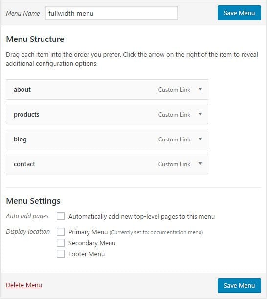
Once you have your menu created, use the visual builder to add a Fullwidth Section just below the header section of the page. Then add a Fullwidth Menu Module to the section.
Update the Fullwidth Menu Settings as follows:
Content Options
Menu: [select menu that should be used in the module]
Background: #333333
Design Options
Text Color: Light
Text Orientation: Center
Menu Font: Roboto
Menu Font Size: 20px
That’s it!
Tip: You may want to take advantage of the Display options under the Advanced tab in order to hide this menu on mobile and show a different menu above the header so that mobile users will see the menu without having to scroll down the page.
Fullwidth Menu Content Options
Within the content tab you will find all of the module’s content elements, such as text, images and icons. Anything that controls what appears in your module will always be found within this tab.
Menu
Select a menu that should be used in the module. You can create new menus using the Appearances > Menus page in your WordPress Dashboard. Each time you create a new menu, the menu will be selectable in this dropdown menu.
Background Color
By default the menu module has a white background color. If you would like to use a different color for your menu background then you can choose it here using the color picker.
Dropdown Menu Background Color
By default, the dropwn menus in your menu module inherit the background color defined in the previous setting. If you would like your dropdown menus to have their own unique color you can choose a custom color using this setting.
Mobile Menu Background Color
On mobile, the menu module transforms into a different and more mobile-friendly design. You can control the background color of the mobile dropdown menu independently from it’s desktop counterpart.
Admin Label
This will change the label of the module in the builder for easy identification. When using WireFrame view in the Visual Builder, these labels will appear within the module block in the Divi Builder interface.
Fullwidth Menu Design Options
Within the design tab you will find all of the module’s styling options, such as fonts, colors, sizing and spacing. This is the tab you will use to change how your module looks. Every Divi module has a long list of design settings that you can use to change just about anything.
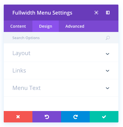
Sub-Menus Open
By default, all sub menus open in a dropdown menu below the main menu bar. If you are placing your menu towards the bottom of the page, and your menu contains long dropdown menus, you may wish to have those menus open above the menu module instead so that the menu does not extend beyond the browser viewport.
Make Menu Links Fullwidth
By default, the top level links with the menu module are placed inside the bounds of your default content width. If you would like to remove this restriction and have your links extend the full width of page, starting from far left of the screen, then you can enable this option.
Dropdown Menu Line Color
Within dropdown menus, links are separated by a 1 pixel line. If you would like to customize the color of this line, you can choose a custom color using the color picker in this setting.
Text Color
Here you can choose the value of your text. If you are working with a dark background, then your text should be set to light. If you are working with a light background, then your text should be dark.
Text Orientation
This controls the how your text is aligned within the module. You can choose between Left, Right and Centered.
Active Link Color
Active link colors are highlighted in the menu module to show the user their current location. You can change the highlight color that is used for these active links using this setting.
Dropdown Menu Text Color
By default, text within the module’s dropdown menus inherit the main menu text color. However, you may wish to change this color if you have defined a custom dropdown menu background color.
Mobile Menu Text Color
By default, text within the module’s dropdown menus inherit the main menu text color. However, you may wish to change this color if you have defined a custom mobile menu background color.
Menu Font
You can change the font of your menu font by selecting your desired font from the dropdown menu. Divi comes with dozens of great fonts powered by Google Fonts. By default, Divi uses the Open Sans font for all text on your page. You can also customize the style of your text using the bold, italic, all-caps and underline options.
Menu Font Size
Here you can adjust the size of your menu font. You can drag the range slider to increase or decrease the size of your text, or you can input your desired text size value directly into the input field to the right of the slider. The input fields supports different units of measurement, which means you can input “px” or “em” following your size value to change its unit type.
Menu Text Color
By default, all text colors in Divi will appear as white or dark gray. If you would like to change the color of your number text, choose your desired color from the color picker using this option.
Menu Letter Spacing<
Letter spacing affects the space between each letter. If you would like to increase the space between each letter in your number text, use the range slider to adjust the space or input your desired spacing size into the input field to the right of the slider. The input fields supports different units of measurement, which means you can input “px” or “em” following your size value to change its unit type.
Menu Line Height
Line height affects the space between each line of your number text If you would like to increase the space between each line, use the range slider to adjust the space or input your desired spacing size into the input field to the right of the slider. The input fields supports different units of measurement, which means you can input “px” or “em” following your size value to change its unit type.
Fullwidth Menu Advanced Options
Within the advanced tab, you will find options that more experienced web designers might find useful, such as custom CSS and HTML attributes. Here you can apply custom CSS to any of the module’s many elements. You can also apply custom CSS classes and IDs to the module, which can be used to customize the module within your child theme’s style.css file.
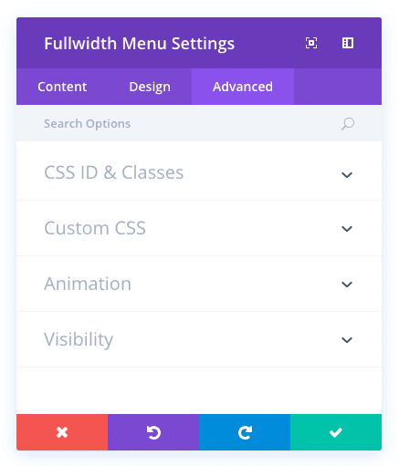
CSS ID
Enter an optional CSS ID to be used for this module. An ID can be used to create custom CSS styling, or to create links to particular sections of your page.
CSS Class
Enter optional CSS classes to be used for this module. A CSS class can be used to create custom CSS styling. You can add multiple classes, separated with a space. These classes can be used in your Divi Child Theme or within the Custom CSS that you add to your page or your website using the Divi Theme Options or Divi Builder Page Settings.
Custom CSS
Custom CSS can also be applied to the module and any of the module’s internal elements. Within the Custom CSS section, you will find a text field where you can add custom CSS directly to each element. CSS input into these settings are already wrapped within style tags, so you need only enter CSS rules separated by semicolons.
Dropdown Menu Animation
You can choose between various animations to be used when a dropdown menu is activated. By default the animation is set to fade, but you change that to: expand, slide or flip.
Visibility
This option lets you control which devices your module appears on. You can choose to disable your module on tablets, smart phones or desktop computers individually. This is useful if you want to use different modules on different devices, or if you want to simplify the mobile design by eliminating certain elements from the page.

