How to use
In this chapter, we will focus on building the content using Wraps and Elements.
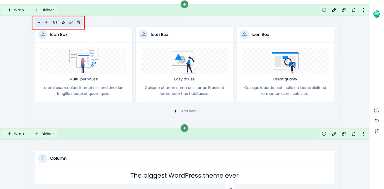
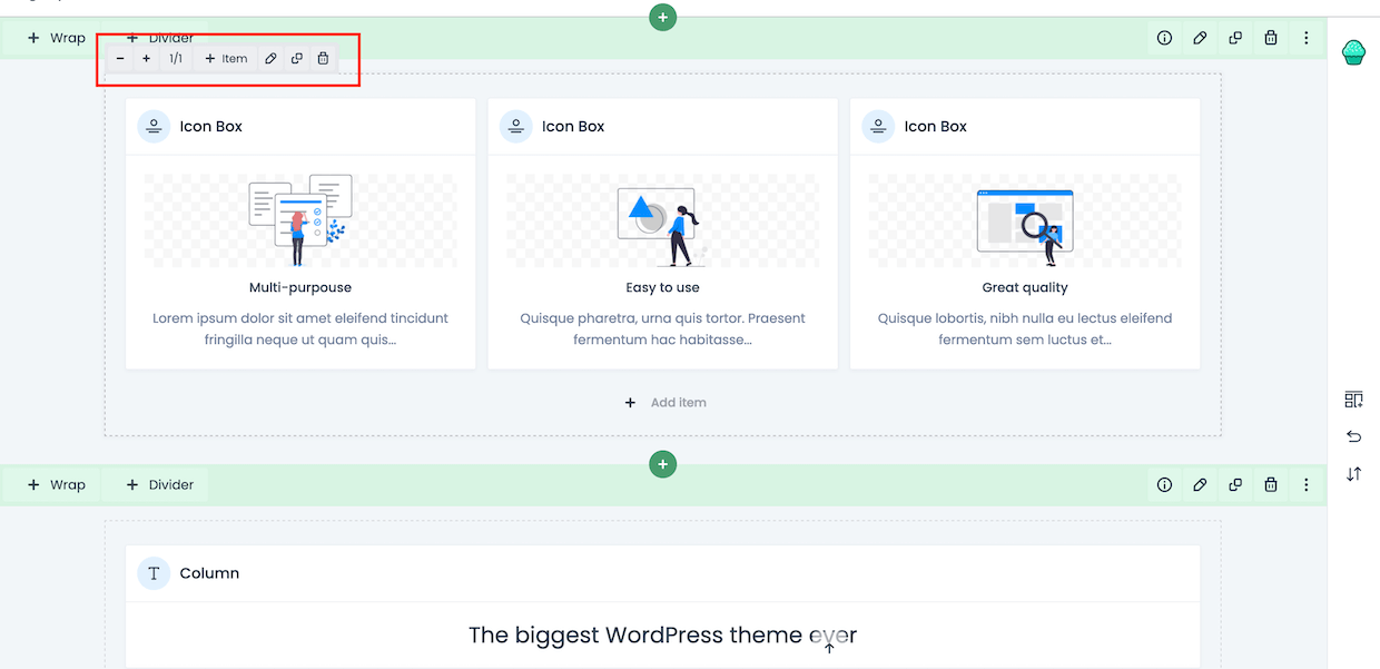
Let's start with what the Wrap is. It's a block where we can add elements. You can choose from included wrap layouts or create own. Wrap options bar is grey colour and each has the following options (starting from the left):
- + & - these icons let you increase or decrease the size of current wrap
- 1/1 this is the size of actual wrap
- +Item by clicking, the popup with all available elements will appear
- Pencil icon, when clicked it will open a window with all options available for that specific wrap. You can also double-click on wrap to perform the edit action
- Clone icon, when clicked it will close that specific wrap
- Trash icon, when clicked will remove that specific wrap

- + & - these icons let you increase or decrease the size of the element
- 1/1 this is the size of actual wrap
- Pencil icon, when clicked it will open a window with all options available for that specific element. You can also double-click on the element to perform the edit action
- Clone icon, when clicked it will close that specific element
- Trash icon, when clicked will remove that specific element


