The Divi Text Module
How to add, configure and customize the Divi text module.
Text can be added anywhere on your page. Text modules can be placed within any column type, and when combined with other modules, they make for a truly dynamic page. When you add a text module, you are given all of the editing capabilities of a normal WordPress page. The text module can be used to create a small bit of text within a complex layout, or it can be used in a full width column to create an entire page.
How To Add A Text Module To Your Page
Before you can add a text module to your page, you will first need to jump into the Divi Builder. Once the Divi Theme has been installed on your website, you will notice a Use Divi Builder button above the post editor every time you are building a new page. Clicking this button will enable the Divi Builder, giving you access to all of the Divi Builder’s modules. Next, click the Use Visual Builder button to launch the builder in Visual Mode. You can also click the Use Visual Builder button when browsing your website on the front end if you are logged in to your WordPress Dashboard.

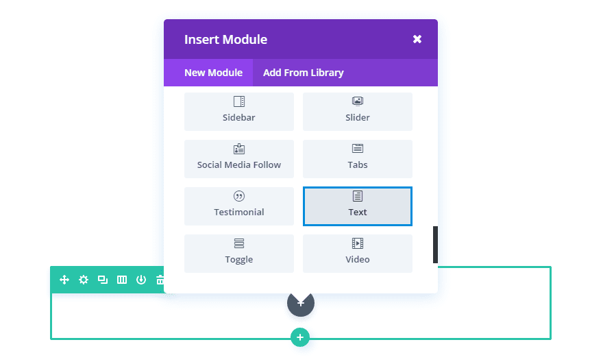
Once you have entered the Visual Builder, you can click the gray plus button to add a new module to your page. New modules can only be added inside of Rows. If you are starting a new page, don’t forget to add a row to your page first. We have some great tutorials about how to use Divi’s row and section elements.

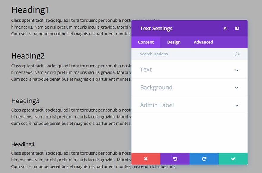
Locate the text module within the list of modules and click it to add it to your page. The module list is searchable, which means you can also type the word “text” and then click enter to automatically find and add the text module! Once the module has been added, you will be greeted with the module’s list of options. These options are separated into three main groups: Content, Design and Advanced.
Content Options

Text Content
This field is where you can enter the body content of your module. Text content spans the full width of the column that it is in.
If your text is being placed onto a dark background the Text Color should be set to ‘Dark’. Visa versa, if your text is being placed onto a light background, the Text Color should be set to ‘Light’.
Background Color
Here you can choose a background color for your text module.
Background Image
Here you can choose a background image for your text module.
Admin Label
By default, your text module will appear with a label that reads ‘Text’ in the builder. The Admin Label allows you to change this label for easy identification.
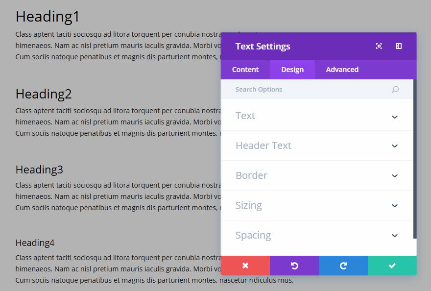
Design Options

Here you can style and/or position your text or header text just how you want it by choosing the text color, orientation, font, font size, font spacing, and line height.
You can also designate a border style, set a max width for your module, and add custom margin and padding.
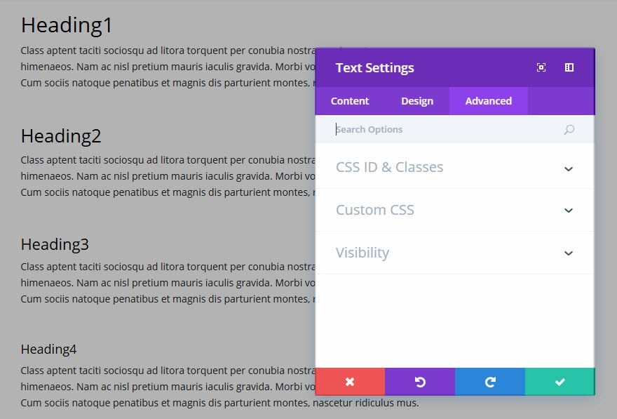
Advanced Options

Use the advanced options to give your text module custom CSS ID’s and Classes. Add some custom CSS for advanced styling and designate the module’s visiblity on certain devices.

