The Divi Toggle Module
How to add, configure and customize the Divi toggle module.
Toggles are a great way to consolidate information and improve user experience on your page. Using Divi, you can create any number of toggles that will look great inside any sized column.
How to Add a Toggle Module to Your Page
Before you can add a toggle module to your page, you will first need to jump into the Divi Builder. Once the Divi Theme has been installed on your website, you will notice a Use Divi Builder button above the post editor every time you are building a new page. Clicking this button will enable the Divi Builder, giving you access to all of the Divi Builder’s modules. Next, click the Use Visual Builder button to launch the builder in Visual Mode. You can also click the Enable Visual Builder button when browsing your website on the front end if you are logged in to your WordPress Dashboard.

Once you have entered the Visual Builder, you can click the gray plus button to add a new module to your page. New modules can only be added inside of Rows. If you are starting a new page, don’t forget to add a row to your page first. We have some great tutorials about how to use Divi’s row and section elements.
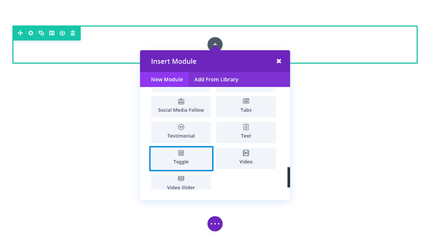
Locate the toggle module within the list of modules and click it to add it to your page. The module list is searchable, which means you can also type “toggle” and then hit enter to automatically find and add the toggle module! Once the module has been added, you will be greeted with the module’s list of options. These options are separated into three main groups: Content, Design and Advanced.
Use Case Example: FAQ Page
An FAQ page is one of the best places to consolidate information using the Toggle Module. It allows the user to quickly identify what question they want to without having to read through tons of text. For this example I’m going to show you how you can use the Toggle Module to design a modern FAQ section for your FAQ page in minutes.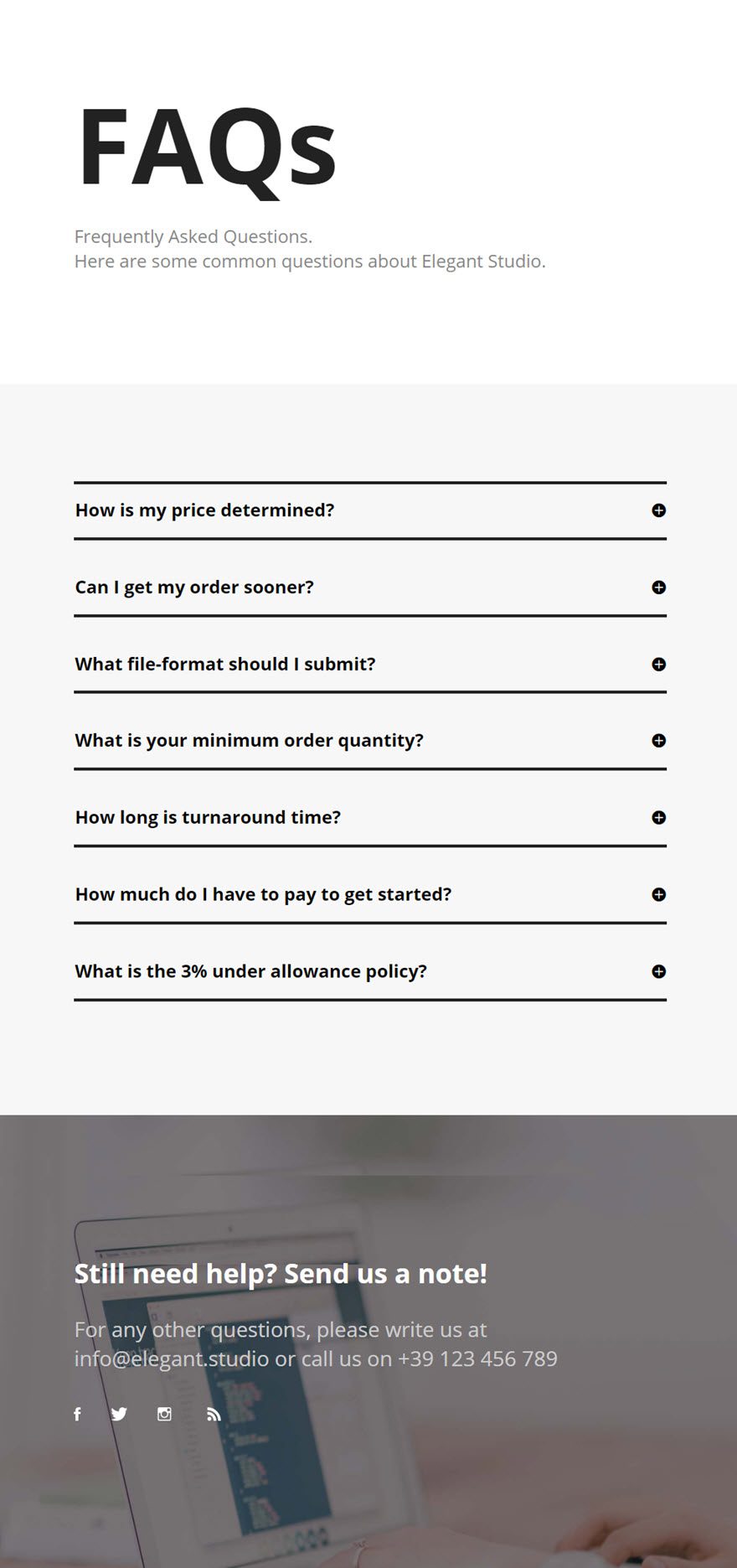
Using the Visual Builder, add a new section with a fullwidth (1 column) row. Then add a Divider module to the row. Under the Content tab of the Divider Module Settings, select the option to “Show Divider”.
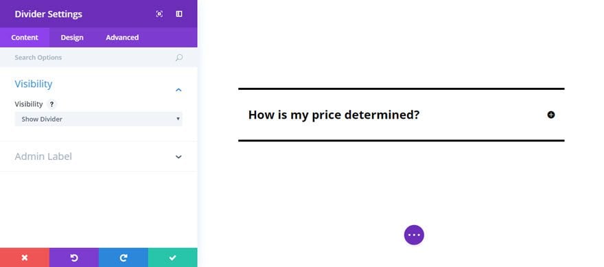
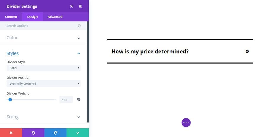
Under the Design Tab, enter the following options:
Color: #000000 (black)
Divider Style: Solid
Divider Position: Vertically Centered
Divider Weight: 4px
Height: 1
Next add a Toggle Module under the Divider I just created in the same row. In the Toggle Module Settings, update the following:
Content tab
Title: [enter your title]
Content: [enter your content]
State: Close
Open Toggle Background Color: #ffffff
Closed Toggle Background Color: #ffffff
Background Color: #ffffff
Design tab
Icon Color: #000000
Open Toggle Text Color: #000000
Closed Toggle Text Color: #000000
Title Font: Open Sans, Bold
Title Font Size: 24px
Title Text Color: #000000
Body Font: Open Sans
Body Font Size: 18px
Body Text Color: #666666
Body Line Height: 1.6em
Use Border: YES
Border Width: 0px
Custom Padding: Top 2px, Bottom 2px
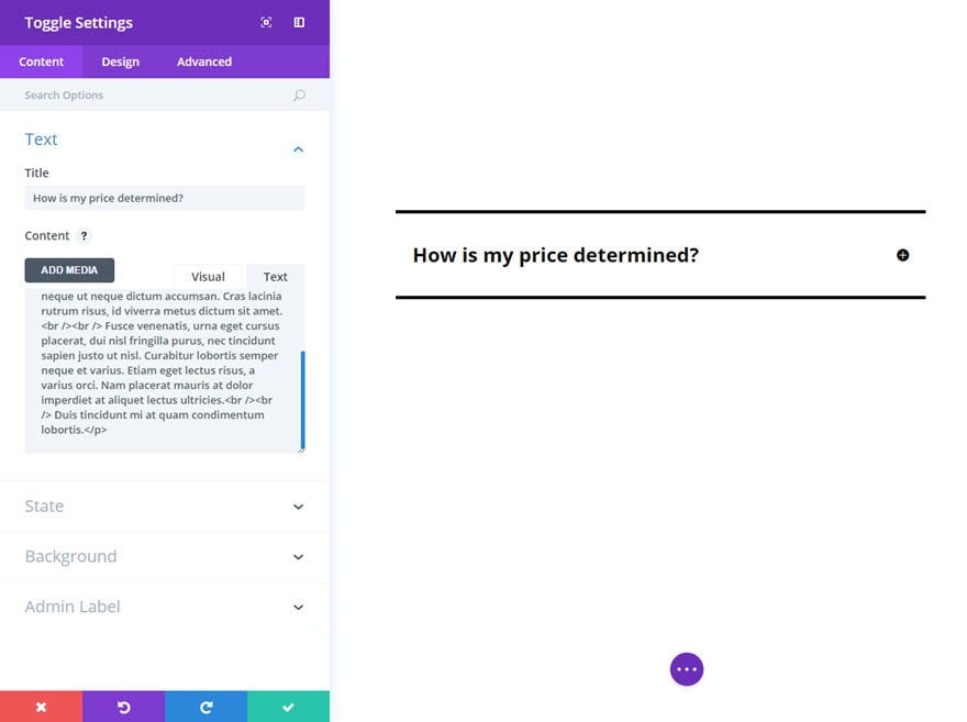
After you have saved your setting for the Toggle Module, duplicate the Divider Module you created and place it underneath the Toggle Module. This will frame the Toggle with a top and bottom divider line. After that, duplicate your Toggle Module and place it after the bottom divider line. Since this is a duplicate Toggle Module, all the design settings have carried over to the new Toggle and all you need to do is update the content of the new Toggle Module. Then continue the process of duplicating divider modules and Toggle Modules and updating the content of your Toggles until you have all the FAQ section completed.
That’s it. Now you have a modern FAQ section using the Toggle Module to consolidate your questions and answers.
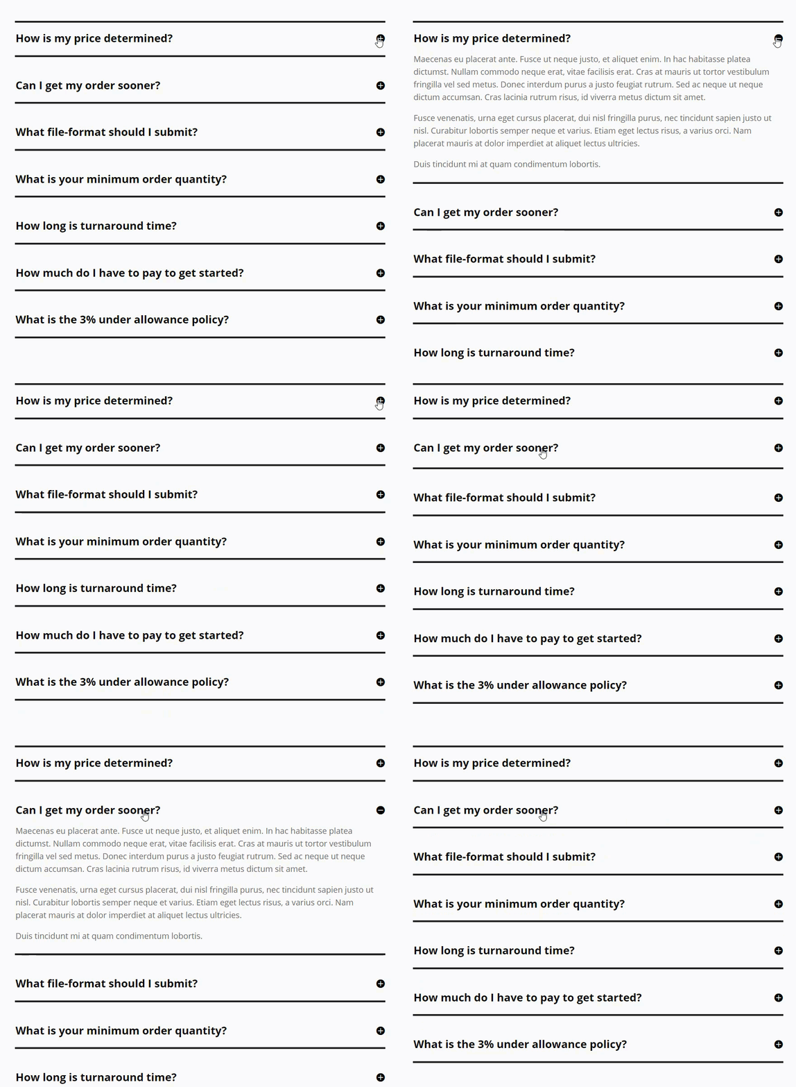
Now that you’ve seen the toggle module in action, dive into ALL of it’s settings in the sections below. We’ve provided a detailed rundown of what you will find inside each tab of the module’s settings and an explanation of what each one does.
The Toggle Module Content Settings
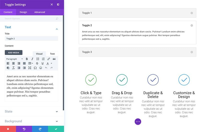
The toggle module’s content tab is organized into the following groups of settings (which also toggle!).
Text
This is where you are able to add the toggle title and content.
State
You can choose whether or not you want your toggle to appear open or closed by default with this setting.
Background
Here you can change the open toggle background color and the closed toggle background color. You can also easily make them the same thing by setting the background color option. There is also the option to set or upload a background image.
Admin Label
By default, your toggle module will appear with a label that reads ‘Toggle’ in the builder. The Admin Label allows you to change this label for easy identification.
The Toggle Module Design Settings
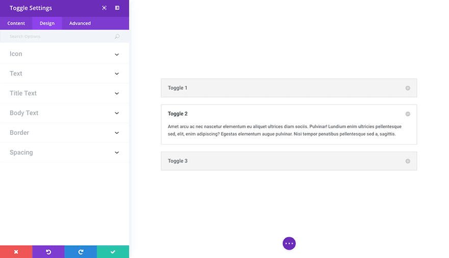
The toggle module’s design settings have been grouped into the following dropdown toggles under the design tab.
Icon
This is where you can change the toggle icon color.
Text
Here you’re able to set the color for open and closed toggle text.
Title Text
Here you can adjust the title text font, weight, size, color, spacing, line height, and more.
Body Text
Here you can adjust the body text font, weight, size, color, spacing, line height, and more.
Border
Here you can choose to use a border. And if you do choose to use a border, you’re also able to select it’s color, change it’s width, and choose it’s style.
Spacing
In the spacing area you’re able to add custom padding to the top, right, bottom, or left of the toggle. You can also change these values for desktop, tablet, or mobile devices.
The Toggle Module Advanced Settings
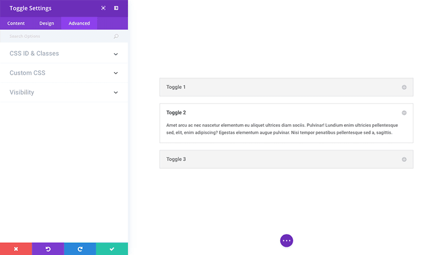
In the Advanced tab of your toggle module you are able to add a unique css id and class. You are also able to add custom css to various pre-defined (and pre-selected) css selectors within the video slider module in the custom css dropdown. And finally in the visibility dropdown you are able to adjust the visibility of your module on phones, tablets, and desktops.

