Build Your Footer
Similar to the Header, the Footer is a section shown across all (or almost all) pages and posts on your posts. The main difference is that the Footer is located at the bottom of your website. Thus, contrary to Header, the Footer is often the area that website visitors see the last. It’s not rare that people miss the opportunity to build a good footer, but this can really make a difference with keeping users on your website as well as with conversions, subscriptions, etc.
This is the place where your visitors expect to find some key information like company details, contact information, social media links, or some additional or related content and links.
This is often a great place to add your links to other offerings you might have or put the most important links and call to action buttons to avoid the need of scrolling back to the top.
Here again, the Astra theme comes with a drag & drop Footer Builder allowing you to build your footer equally easy as your header.
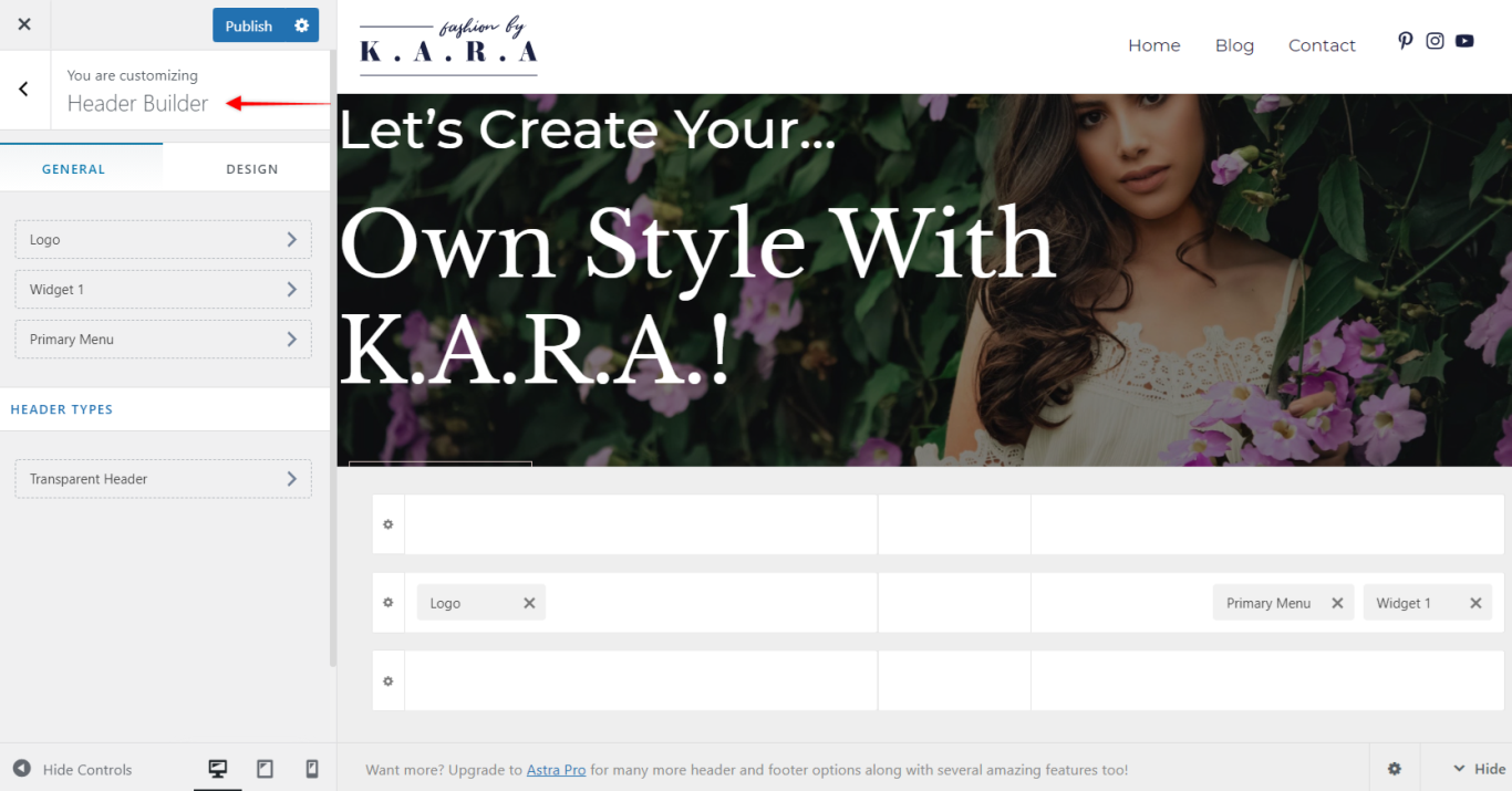
General and Design tabs
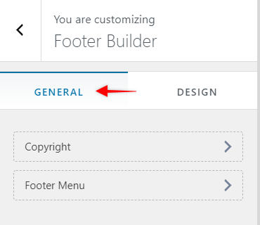
General tab is your default view when opening the Footer Builder. Here you have an overview of your footer setup.
On a left side menu, all of your active footer elements will be listed.
Rest of the screen is showing a live preview of your footer and the position of your elements across footer sections in your Visual Footer Builder.
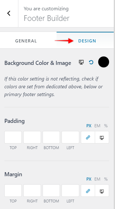
Design tab gives you options of setting the Background Color & Image for the whole footer, as well as adding Padding and Margin.
Visual Footer Builder
Same as with Header, the Visual Footer Builder consists of three separate sections too.
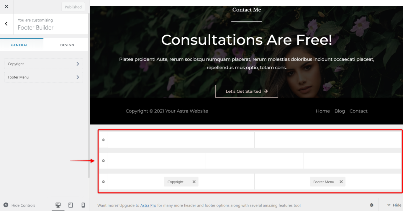
These three Footer sections are:
- Primary Footer – the middle section; this is your main footer section.
- Above Footer – the upper section; often this is the place to add your subscription form or call to action buttons
- Below Footer – the lower section; usually Copyright information and come contact or company information are placed here (like address, phone number/e-mail, company registration number etc.)
As with the header sections, each footer section customizations are accessed by clicking on the “cog” icon on the left side of the sections.
Each section has two tabs:
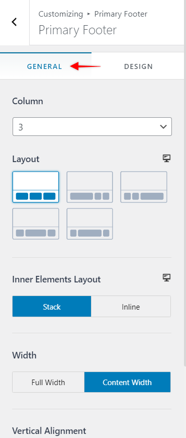
General tab – Footer
Column – select the number of columns you want to add to this footer section;
Layout – choose the column layout based on the selected number of columns;
Inner Elements Layout – display widgets in the same column Stacked (on top of each other) or Inline (next to each other)
Width – set the footer content width to Full Width (edge to edge) or to Content Width
Height – set height of this footer section.
Vertical Alignment – vertically align element content across all the columns within this footer section to Top, Middle or Bottom of the section.
Hide on Mobile – hide this header on mobile devices.
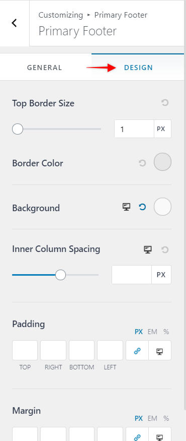
Design tab – Footer
Top Border Size (& Color) – add the top border to the footer section by setting the size of your border.
Border Color – Once you set your border size, an additional option will appear (Border Color) for choosing the color of the border;
Background – set this footer background color;
Inner Column Spacing – add space within each column;
Padding – add padding on one or more sides of the footer;
Margin – add a margin on one or more sides of the header.
Each footer section can be customized separately for desktop and mobile. You can add different footer elements or change their positions for each viewport.
Footer Elements
You can build your footer the same way as your header. Compared to Header Builder, the Footer Builder offers a somewhat smaller number of elements. You will be able to add the following elements to your footer sections: Footer Menu, Social, HTML, Widget, and Copyright.
Further down, we will show you how to use elements specifically available for the footer and a few of those used also for headers but with slightly different settings. The Rest of the elements are used the same way as with Header Builder.
Primary Menu
Here, you will see the menu items you added to your Footer Menu (Dashboard > Appearance > Menus).
In the General tab you can set the menu Layout to Inline or Stack and set the menu items Alignment.
The Design tab will allow you to set the Text and Background colors, Menu Font Size, Menu Spacing and Margin.
Social (Footer)
Compared to the Social element used for header, the footer Social element has the additional Alignment option in the General tab
Copyright
This element allows you to simply add and style your Copyright and it can be used only within the Footer. You can use the following shortcodes here:
- [copyright]
- 2021
- [site_title]
- [theme_author]
